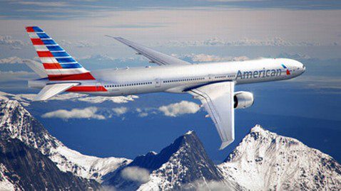
American Airlines has been going through some tough times. But now they're revitalizing in spectacular fashion, as evidenced by the new design scheme for its fleet. The new logo and livery are the first fleet-wide updates in 40 years.
While the nation's third largest airline is in merger talks with US Airways, should the companies reach an agreement the new airline will be called American Airlines. If the airlines do merge, it will be the world's largest.
The new logo is a brilliant marketing move. It represents a symbol of change, modernization and innovation. The new tail, reminiscent of an American flag flying proudly, is a bold reflection of American's origin and name. Executives at American Airlines are to be commended for seeing several moves ahead and embracing marketing as a strategy that can help achieve their goals faster.
The new look and logo begin to brand American Airlines for the future, whether or not the merger goes through. It is also perfect branding for US Airways. It is far more graphic, modern and distinguishable than the previous, 40-year-old look. It is reinvigorating, inspiring – a perfect example of adept and nimble marketing accelerating progress.